A good logo is more than a symbol — it’s a distilled expression of purpose, ready to be recognised at a glance
Pirate Bikes: Building an identity with charge and edge
Design of logo and basic style guide
This custom electric bike company wanted a bold, playful identity — something instantly recognisable, embodying pirate spirit and electric power.
The design process began with a series of icon explorations. Classic pirate skull-and-crossbones elements were reimagined using bicycle components — handlebars, chain links — and electric symbols like plugs and a lightning fork. These elements were tested in various combinations to balance clarity with character.
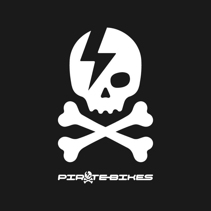
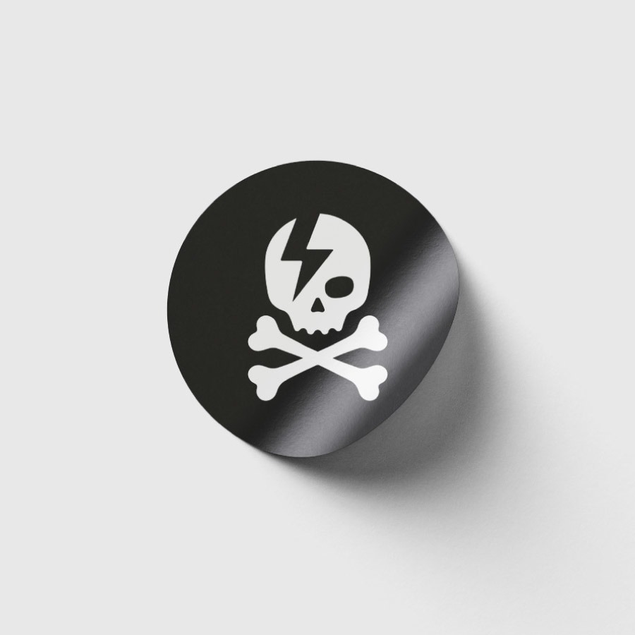
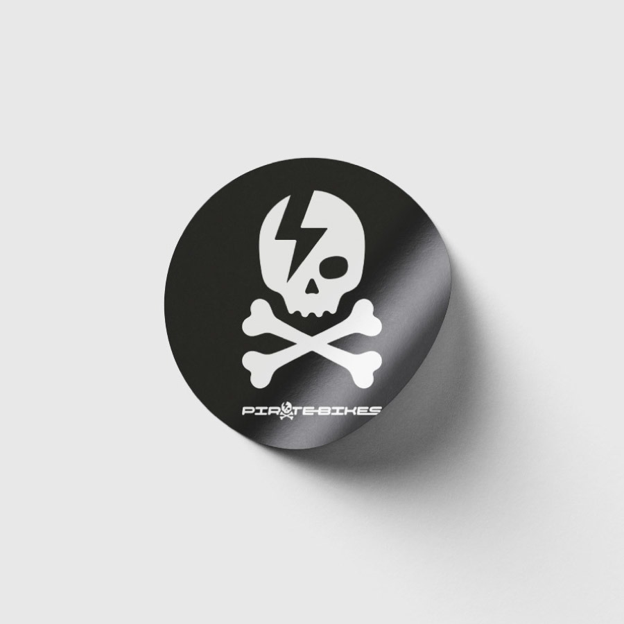
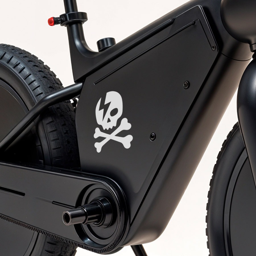
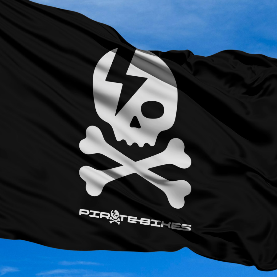
Through a collaborative process of review and refinement with the client, we landed on a final icon: a skull and crossbones with a bold lightning bolt across the skull — a clean, energetic mark with a subtle nod to Bowie (a personal favourite of the client).
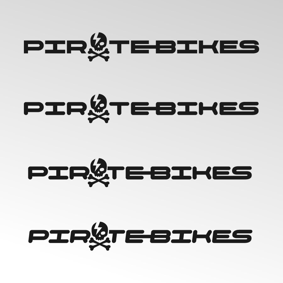
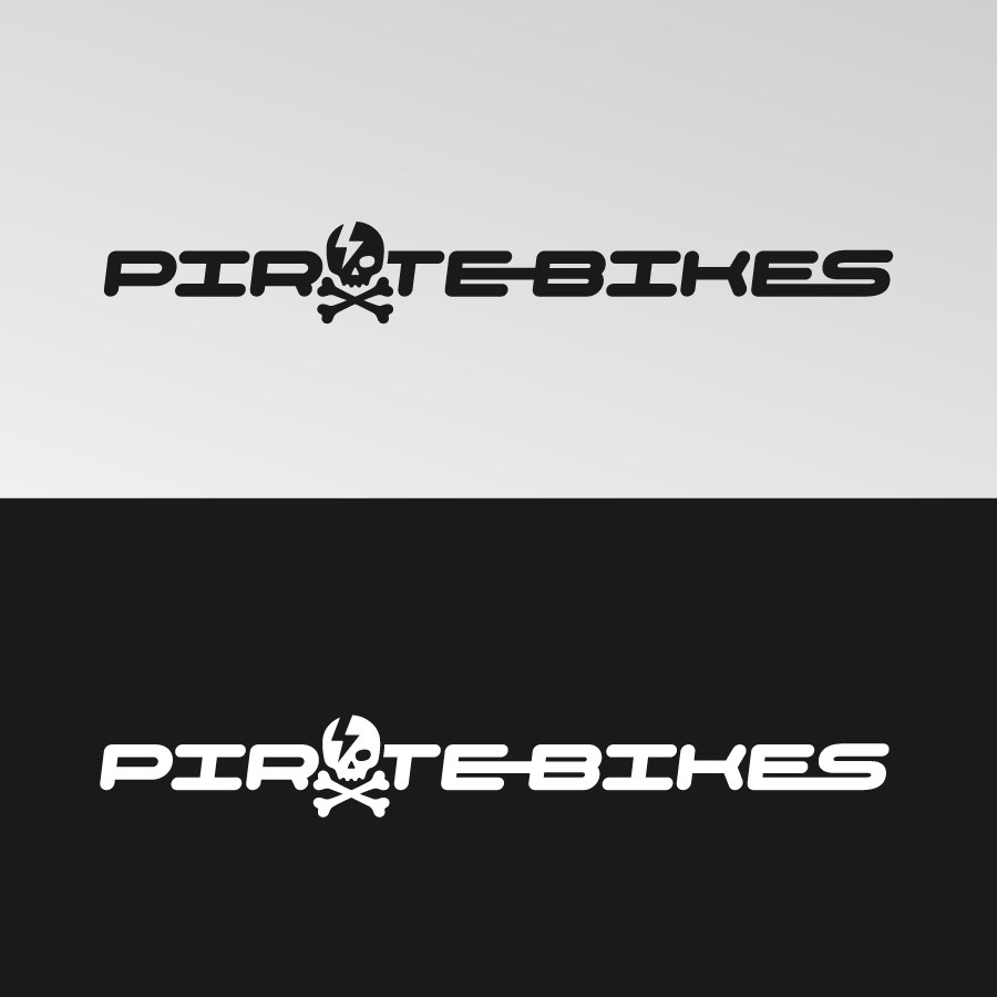
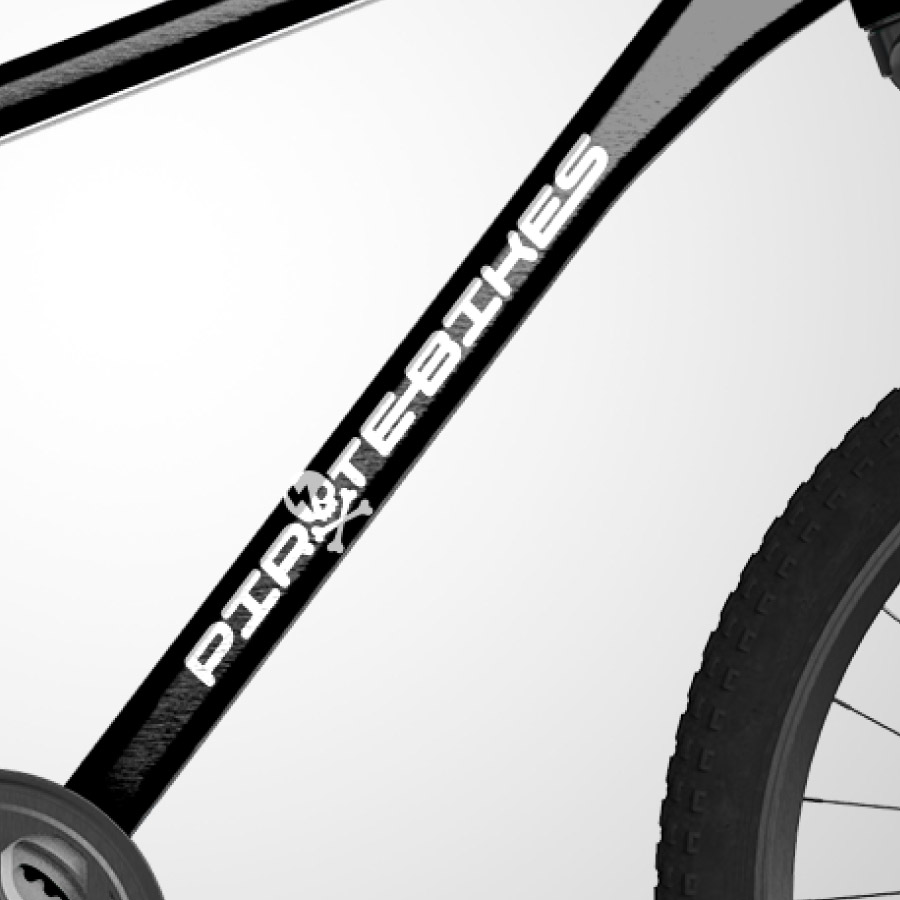
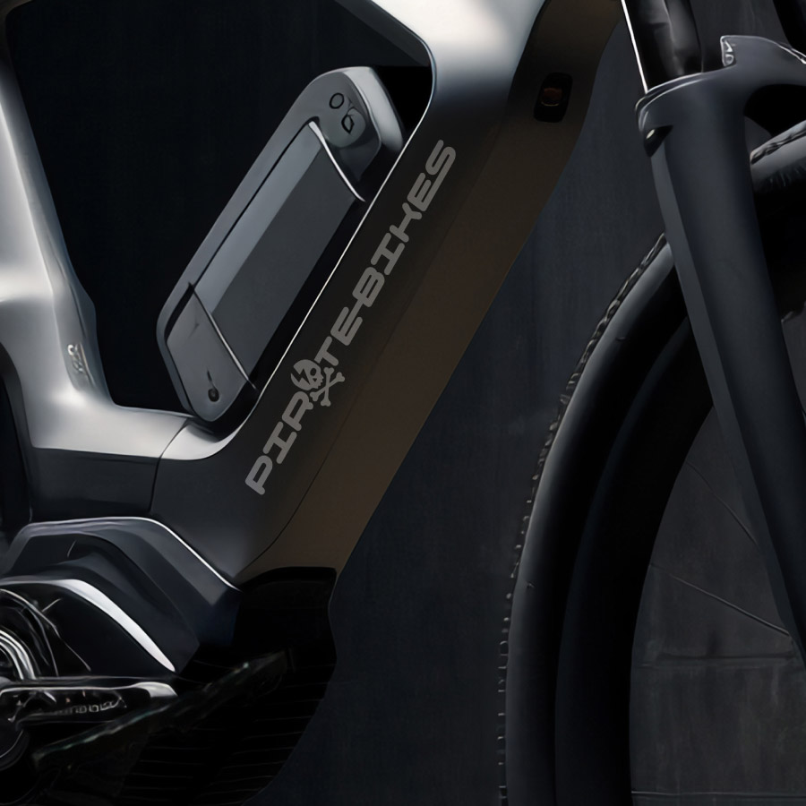
With the icon finalised, the next step was customising a typeface. Rounded corners and joined letterforms added a sense of motion and flow — echoing both electricity and cycling. The final logo is strong, simple, and versatile: black-on-white and white-on-black options make it easy to apply across bikes, gear, signage and more.

Somerset Bean
Graphic design | Artwear | Murals
Bristol, UK
Bean the change you want to see in the world

